Recreating the Past With Photos of a Town That Never Was
Michael Paul Smith modeled an entire fictional 20th century town at 1/24 scale. His clever photography brought the town of Elgin Park to life. We regret to inform that Mr. Smith passed away in November, 2018.
Introduction
It’s not uncommon for people to build models and then photograph them in a realistic setting. However, it takes a special level of talent and craftsmanship to make the resulting photos look totally believable. Michael Paul Smith took it a step further and created an imaginary town from memories of his youth. His photos tell a story of mid-20th century America, and they immerse viewers in that time and place.
In late 2009, Michael Paul Smith had been steadily adding pictures to his Flickr photostream when the site started receiving an uptick in visits. Michael’s page had been receiving about 200 hits a day, but his work suddenly went viral, and by January 2010 he had over 20 million views. In March of that year, the New York Times ran an article that brought Michael’s work to an even larger audience. It was around this time that Michael’s work came to the attention of the Craftsmanship Museum, and we were equally impressed with the tiny imaginary town of Elgin Park.
We quickly saw Michael’s rare ability to create totally realistic scenes through the use of excellent 1/24 scale models and carefully curated photography. Though there are other fine model makers out there, Michael combined architectural model making, photography, and accurate period research to reconstruct small town America from the 1930’s-1960’s. Using high quality diecast model cars to augment his scenes, Michael successfully recreated an era that many people consider, “the best of times.”
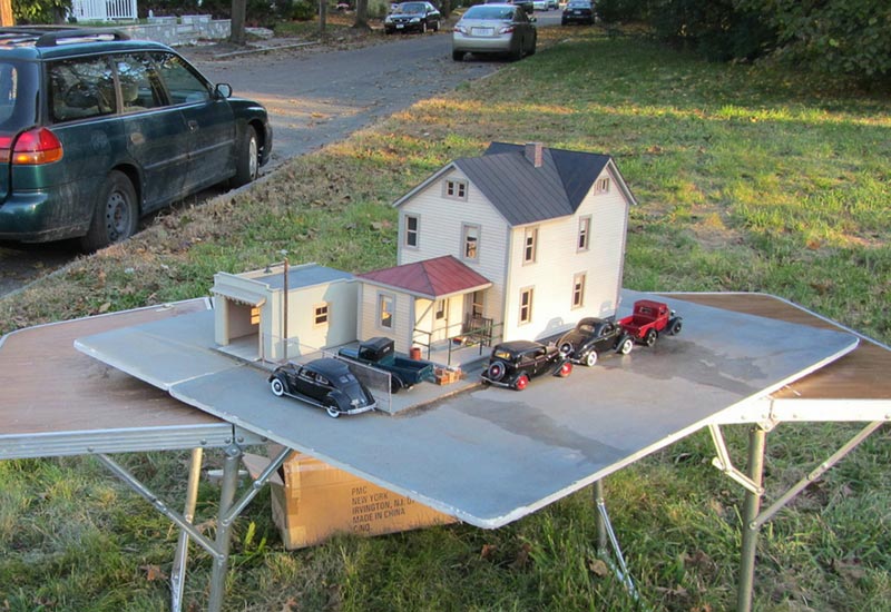
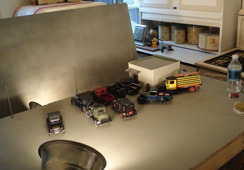
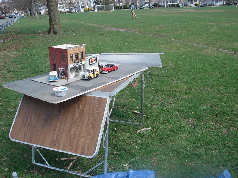
A typical outdoor setup for Michael’s photography looks fairly simple. However, the lighting, background, and camera angle are critical. The scale model buildings and diecast cars are placed on a table and photographed against a real backdrop.
Now, Michael’s photos of Elgin Park are believable for a number of reasons. At first glance, it’s clear that the backgrounds, lighting, and subjects were expertly integrated. Even more impressive, however, is the extensive and thorough research that went into the small details in each scene.
Additionally, Michael made a great effort to study what makes an old photo look like an old photo. He used filters in PhotoShop to create the look of an old black and white, sepia tone or KodaChrome slide, further enhancing the realism. (It should be noted that Michael never used PhotoShop to alter the hardscape elements in any photo.)
One thing about the photos becomes quickly apparent—there are no people. Michael did this on purpose to allow viewers to place themselves in the scene, or to imagine what might happen next. The cars and buildings are the real stars of the shots.
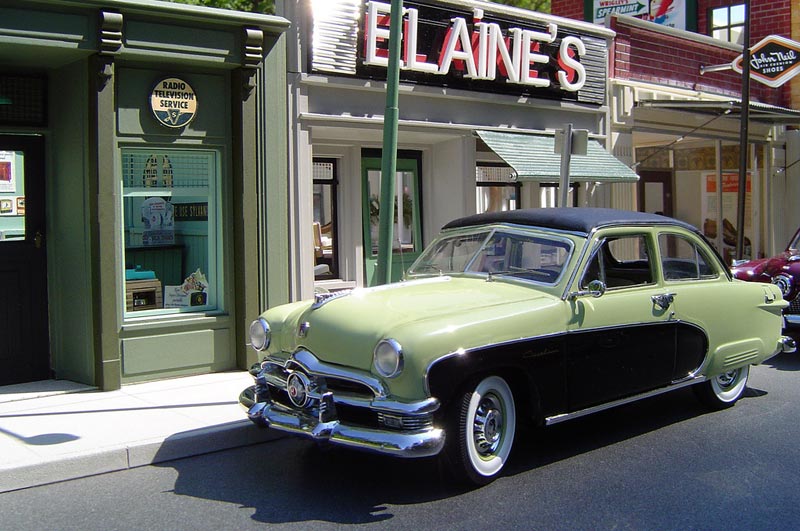
In terms of vehicles, Michael had an extensive collection of Danbury Mint and Franklin Mint diecast autos and trucks to populate the scenes. A 1951 Studebaker Starlight coupe might be parked in front of a 1930’s craftsman style bungalow. Or a row of new 1961 Chevy convertibles might be lined up in front of an old car dealership.
Michael created this small scene representing Freedom, PA. The tiny 1/24 scale town looks like a real scene from the past.
Interestingly, the backgrounds of trees, factories or houses in Michael’s photos often look real because they are. Michael would set up his models on a card table near a street or in a parking lot, and then line up the camera angle perfectly with the horizon. This created a perspective that merges the scale models with real life scenes in a seamless fashion. This also meant that things like trees and telephone poles in the background would be slightly out of focus, just as they are in a real photo.
The lighting is just right, because the natural sunlight hits the background and models at the same angle. Michael also made some night scenes, which were typically photographed inside his small apartment using a simple lighting setup. Usually a single 60-watt bulb and a few well-placed LED lights would do the trick. Michael even went as far as to recreate certain weather conditions and seasons in some of his scenes. He would make streets wet with rain, or create snow drifts on curbs by carefully applying baking soda.
We have chosen a number of photos from Michael’s Flickr Photostream that show how some of the models are made, and how the photos look when finished. Michael was also an accomplished artist, having created some beautiful paitnings and pencil illustrations. Some of his work was used to illustrate children’s books, along with other commercial applications. Michael submitted the following information on how and why he created these inspiring images from his scale models.
We regret to announce that Michael Paul Smith passed away as a result of cancer at the age of 67 on November 19, 2018 in Reading, MA. In an announcement that he wrote before passing, Michael noted that he had, “moved permanently to Elgin Park,” the perfect imaginary town that he created in his clever photos.
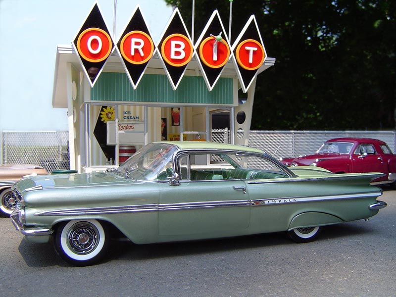
Michael’s scale model Orbit ice cream stand and a 1959 Chevy—both illustrate the pinnacle of 1950’s styling.
The Models, the Pictures, and the Magic
By Michael Paul Smith
My fictional scale model town of Elgin Park is based on my hometown of Sewickley, Pennsylvania. I have no idea where the name Elgin Park came from, but it feels right. For me, it conjures up the essence of “Small Town.” It also says stability; a bit isolated but not desolate. Family. Unlocked doors. Home. Sewickley itself is only one square mile and touches the Ohio River. Granted, every town has its secrets and skeletons, but when you walk down those tree-lined streets, and hear the train whistles echoing off the hills along the river, everything seems OK.
It’s that Ok-ness that I try to capture in my models and photographs. The original thought was to recreate my hometown as closely as possible, but the Artist in me realized everything would have more emotional impact if the buildings had a universal appeal to them. (Sewickley has a good example of every type of small town architecture from the last two centuries.) So it became my goal to just try to capture the flavor of that place.
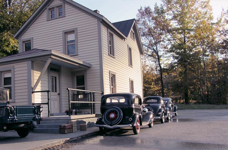
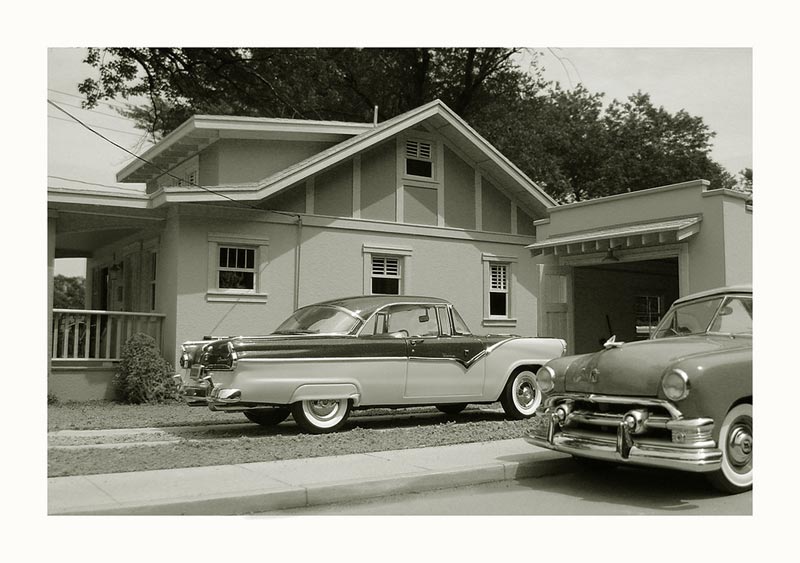
This photo captures a scene from the mid-1950’s in the imaginary town of Elgin Park, somewhere in the American Midwest. Dad’s shiny new Ford is parked outside the family bungalow. The black and white treatment of the photo makes it feel even more authentic. Even though these are just models, the image looks as though it came from an old family album.
A Start in Architectural Models
I worked in an architectural model shop for a number of years with just one other person. My boss was a technical genius. He could make anything. He did the math in his head, and then just made it perfect. My work, on the other hand, is not perfect—but it has an emotional punch to it. Together, we made a great team.
The shop itself had one decent table saw, a mounted belt sander, a crummy drill press, plus a really awful band saw. Later we bought a drum sander. That was it. X-acto blades did the bulk of the work…and sanding blocks!
That was the place I learned my building skills. Oddly enough, I’m just a good model maker, and I’m not being self-effacing here. Before that, I had numerous jobs that all came into play while making Elgin Park.
Here is a short list of previous employment: Art Director for women’s retail stores, illustrator for a text book publisher, editorial artist for a Boston newspaper, wallpaper hanger, interior house painter, museum display designer, and archivist.
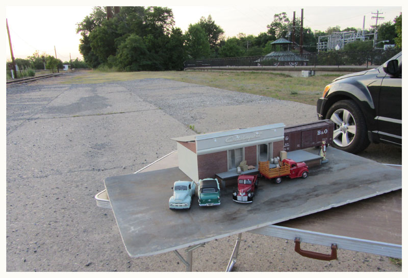
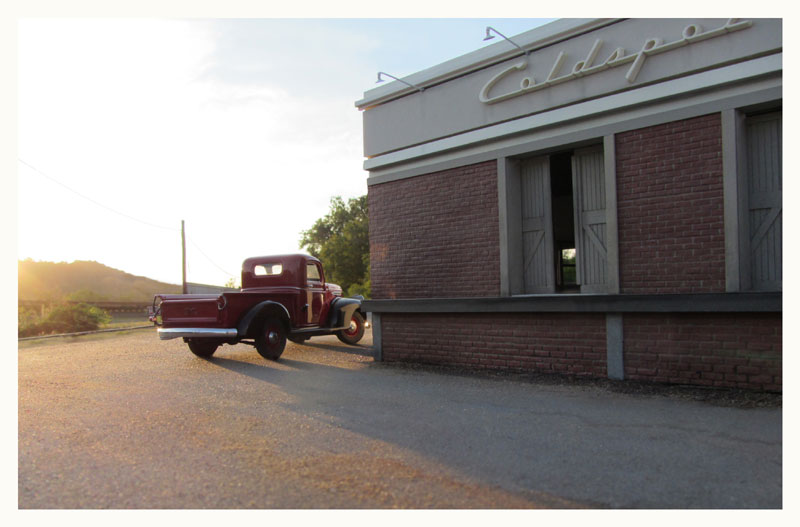
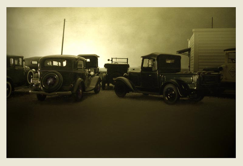
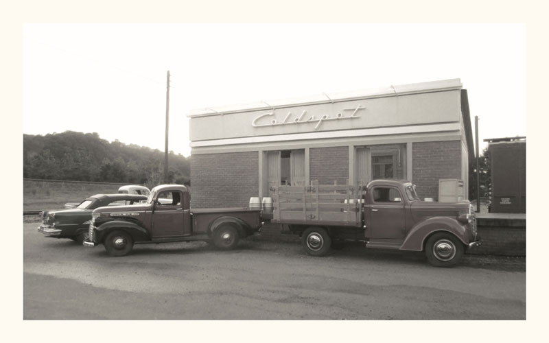
Bud Renger’s Coldspot freight depot is set up on a folding table. Several scale cars are parked out front. This setup took place in Michael’s hometown of Sewickley, PA, which was the inspiration for Elgin Park.
Less is More When it Comes to Visual Information
Through all of these jobs, I learned that things visually “read” better when the amount of information is kept in check. The brain / eye / emotions will fill in the details, even when there is a minimum amount of data available. On the other hand, there can be too much information. When that happens, you end up with a literal representation of something and very little room for personal interpretation.
The more the viewer can project themselves into something, the more powerful it becomes. For myself, it’s all about focusing on the mood and the emotional “gesture.” Also, keeping everything in scale is important—even colors. Just because something is red, it can be painted a different version of red, or you can even just imply that it’s red. Our mind does some wonderful gymnastics to make the world coherent.
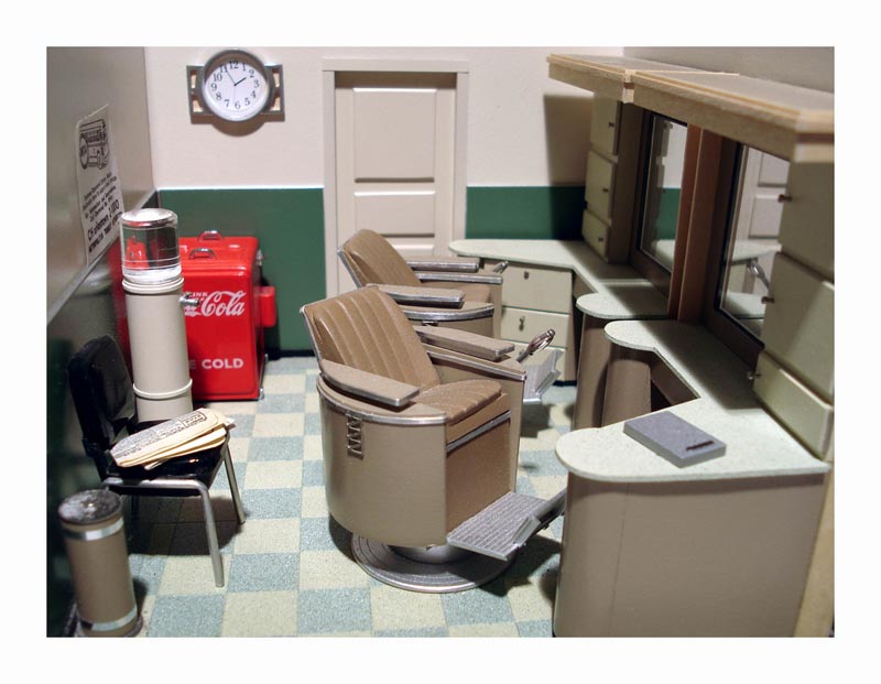
Details from inside the Elgin Park barber shop. Notice the 1/24 scale vintage coke machine, water cooler, ashtray, and folded newspaper on the chair.
Photography
When photographing a scene, I always have the viewer in mind, because I want them to be able to emotionally access the finished image. If it’s too much of my own personal baggage, then the photo just becomes a curiosity. There’s a real balancing act going on in my head during a shoot.
What I learned early on, when taking these photographs, is that it’s not about the individual cars or buildings. As an example: even if there’s a single car in the shot, it shouldn’t say: “Hey look at me!”
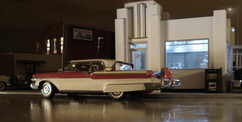
A case in point is the photo of the Mercury Turnpike Cruiser outside the White Tower Diner. That car takes up most of the image, yet the picture is about driving in the rain late at night. The hiss of the tires of passing cars on a wet street, the greasy light from the building’s interior—we all know these feelings when we grab a late meal while on the road. All of the above is very personal to me, yet it’s familiar to everyone else, too, but for other reasons.
Michael noted of this picture, “Here’s the glamour shot of the 1957 Mercury Turnpike Cruiser, which was one of the largest automobiles ever produced. Measuring 20 feet long, it was a veritable living room with turn signals. The scale model White Tower Diner was a perfect match with the car. I used LED lights in the interior of the building to give it a florescent glow. The exterior illumination is from a single 40-watt bulb aimed low.”
An Early Fascination With Models and Miniatures
I have always been fascinated with models and miniatures. Even in grade school I made buildings out of cigar boxes and put interiors in them. That was also true about cars, trucks and train models. I’d put wheels on shoe boxes and cut out windows. When I discovered plastic kits in the late 50’s, it was a defining moment. Speed up to the 1980’s, when diecast cars started to appear, and it was all downhill for me.
These vehicles are my only vice. Having 300 diecast models sitting on a shelf might look impressive, but there is something sad about that. For myself, they needed to be put into a context, and I thought a scale building of some sort would help bring some life to them. I found a G-scale structure in the trash and decided to fix it up and add an interior. The most important goal of this project was that it had to be as good as the diecast cars.
So, I put a huge effort into getting the details correct. When it was completed, I placed some cars around it and photographed the scene. It was an “Ah-Ha!” moment. From the very first photo I took, I could see the inherent story-telling aspects of the “dioramas.” It was only a matter of time before I started to design and make my own structures.
All of the 15 buildings I’ve constructed are in pieces. They are not set up as a town in one room. When doing a photo shoot, I mix and match them, turn them around, or temporarily add to them so they have an altered appearance. This gives me the ability to tell different stories and create different moods. It also allows for a dreamlike feel where the buildings move around in alternate locations.
The Vehicles Tell Part of the Story
The vehicles are visual cues, or lead-ins. They immediately set the “time reference,” even if you don’t consciously know car designs or styles. They can also let you know the type of neighborhood or scene that’s being represented. I could throw a curve to the “story” by having older vehicles lined up, but then place a newer or more expensive vehicle in the same shot.
You find yourself asking: “Why would this new car be here? Who owns this? What’s being set up?” The background and the cars are now interacting and creating a cohesive picture.
How the Buildings are Made
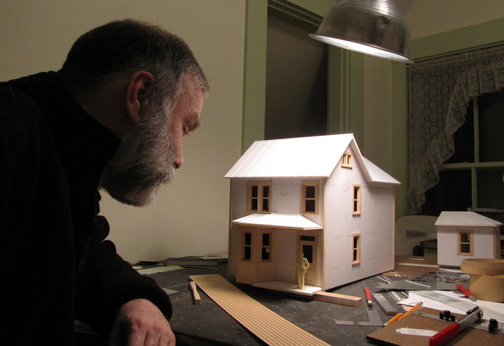
My buildings are handmade. The main material for the basic structures is called Gatorboard. It’s a 3/16-inch thick foam material sandwiched between two pieces of resin coated paper. It’s stiff, lightweight, durable and can be cut with a knife. I draw up rough sketches for each building to work out some of the details, but mostly it becomes a, “little bit of this and a little bit of that,” kind of construction.
Basswood, for trim work and furniture, is the wood of choice. It has a tight grain that is the proper scale to 1/24th scale models. Styrene plastic and Plexiglas (which comes in clear and in many translucent period colors) make up most of the exterior details. Commercial household spray paint in cans is used extensively. A matte or flat finish works best. Sometimes I use interior latex house paint as well.
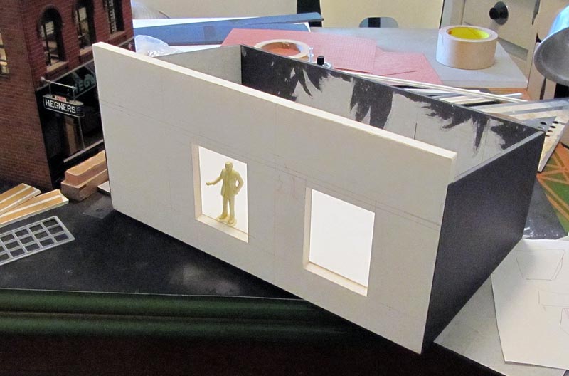
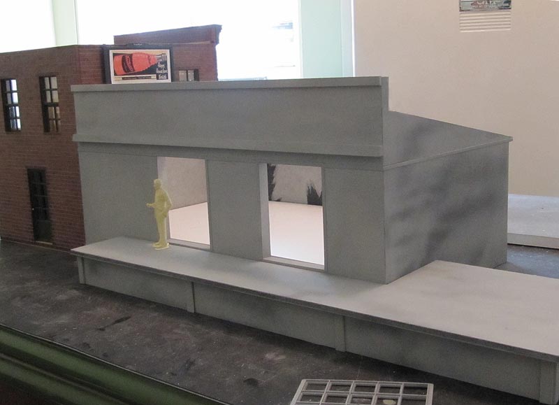
The basic structure for the Coldspot freight depot was coming along here. Each building was made individually so that they could be placed in different orientations.
I try to make most of the objects myself. It’s a challenge I give myself, although when I see a commercially made item that fits the bill, I don’t hesitate to use it. I’m especially proud of the push mower and washing machine I made. Also, the porch glider and matching chair.
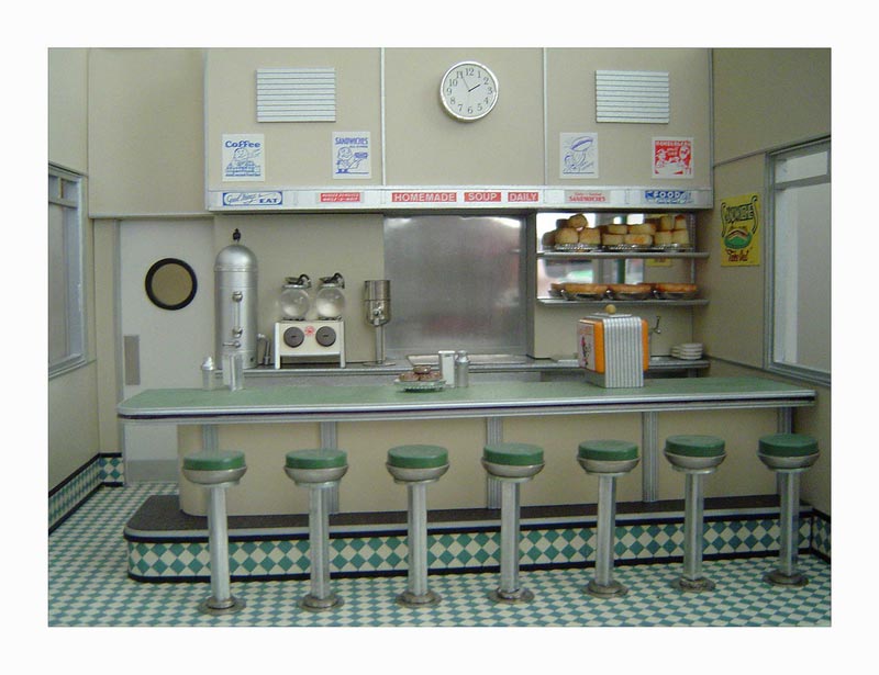
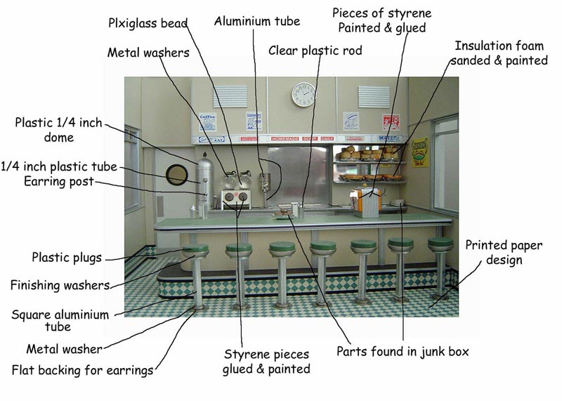
Kit bashing model cars (combining parts from different kits) and trips to the jewelry making store are also a creative challenge. If you look at the photo entitled, “Diner Interior Exposed” (*pictured below) you’ll see all of the items being called out that are found objects. It’s just getting used to seeing things in a different scale.
For the interiors, I print up wallpaper patterns, rugs, and floor liners (linoleum) from catalogs I have, or vintage websites. Gotta love the web!
Each building takes a few weeks to make. Some of them, with complicated or highly detailed interiors, will take longer. The shoe store has over 100 individual shoe boxes, the TV repair shop has dismantled televisions lying about, and the Bungalow is completely furnished. The Bungalow roof has about 1,500 hand cut shingles made from textured paper.
Planning the Scene
I have a good working knowledge of architectural styles throughout the mid-19th century and all of the 20th century.
I also have an understanding of the rhythm of how towns grow and spread. When planning a scene, I look at the vehicles first. What era do I want to explore? I also look at old photographs to learn about how things looked back then.
There are many little details that define an era that are now missing. Things like certain colors that were popular, how streets were set up, and how cars were parked. From all this information I start to think of what direction I want to go. What building or buildings can tell this story? Is it a night shot, snow scene or rainy day? I then mock up the scene and look at it from all angles. This becomes the frame work for the actual shoot.
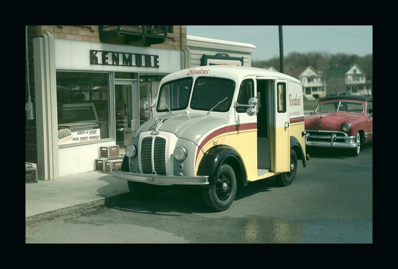
This photo shows Michael’s setup for a scene at Kenmore market in Elgin Park. The scale model buildings and cars were placed on a table for outdoor photography.
Scouting the Background Location
The next step is to go out looking for a suitable background—not an easy task with all the malls and housing developments around. The perfect setup is finding an unobstructed view of at least 100 feet. This allows the background to be in scale with the model. Once I’ve started to shoot, though, an emotional level comes into play. That’s the magic time. I just listen to my gut feeling. If I try too hard, then more times than not, I lose my vision.
An average shoot lasts about an hour with about 20 to 30 photos taken. On average, about two good shots come from the whole batch. When I do an outside shoot, I always bring photos of my work, because people have a difficult time understanding what I’m doing. Once they see the photos, the connection is made.
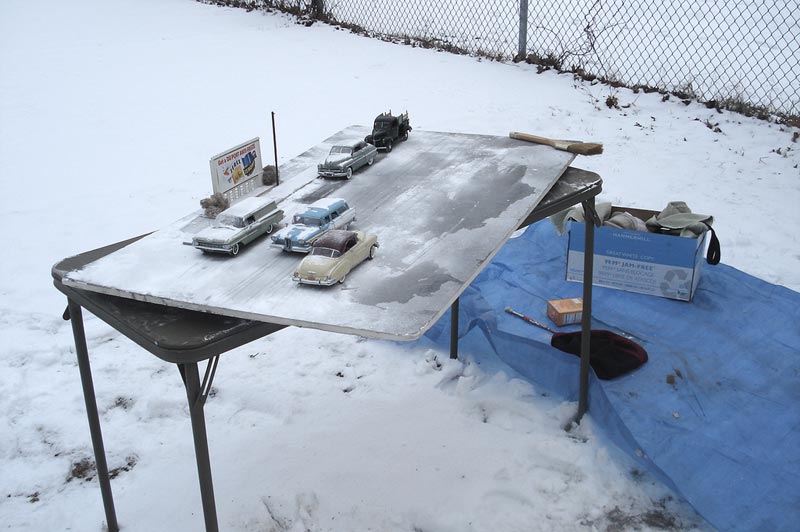
Shown here is Michael’s setup for a winter scene. Scale cars and a billboard are place on a card table outside in the snow.
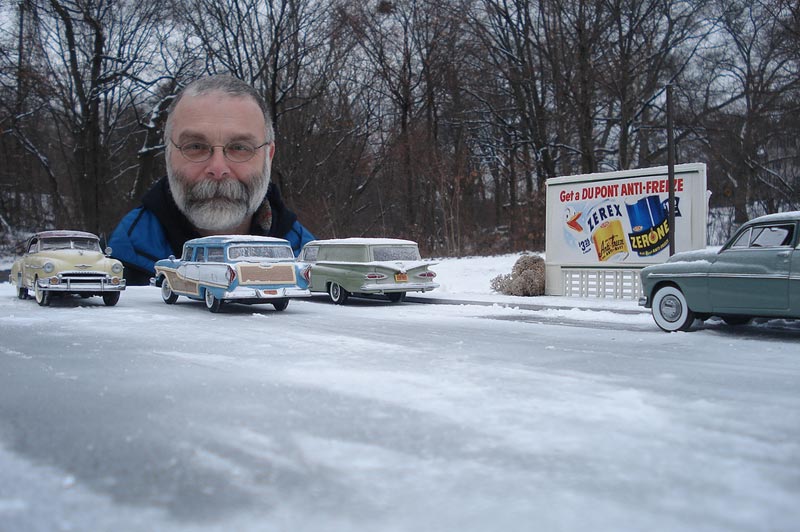
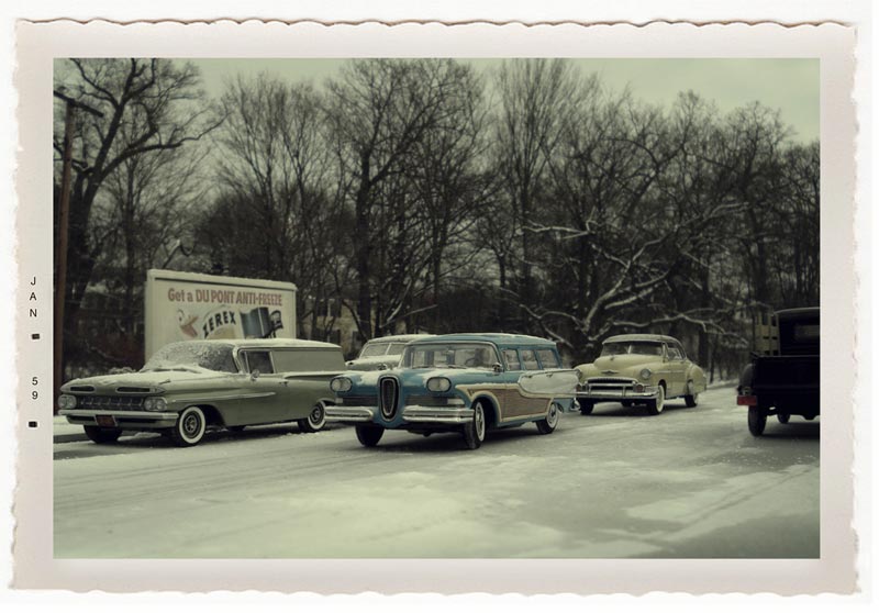
A finished photo of Michael’s winter scene. The snow on the trees in the background is real, but the snow on the street is baking soda. The cars give the scene an approximate date. The billboard and streetlight provide some very simple details to orient the viewer, and imagination takes care of the rest.
Asking permission from the surrounding homeowners to have their houses in the photograph, even if it’s only going to be a blur in the background, is incredibly important. I had one guy who said it was alright, but then got upset for some reason. He started yelling and berating me for what I was doing. Occasionally, a cop will show up and give me “the look.” Indoor shots are another story.
Not having access to special equipment, it was a matter of using what was at hand. A clip lamp with a 40 or 60 watt bulb became my lighting source. Baking soda became “snow.” Rain was achieved by using water from the sink, and “gutter dirt” was the stuff I found in my vacuum cleaner bag. Interior lighting comes about by the use of Christmas lights and small LED’s powered by batteries.
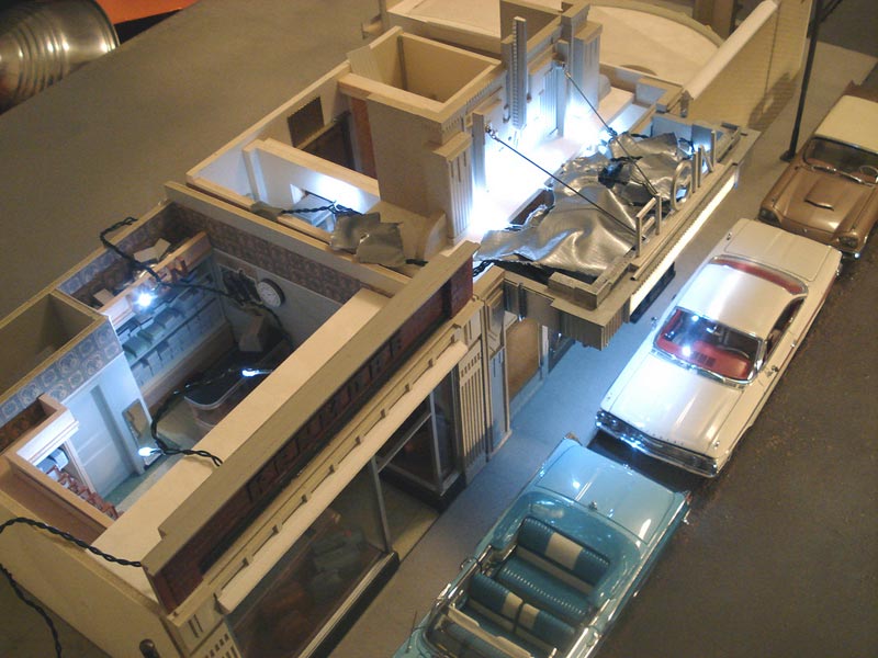
More secrets revealed—this photo shows the setup for a night scene diorama. An LED light is held in place by duct tape on the model.
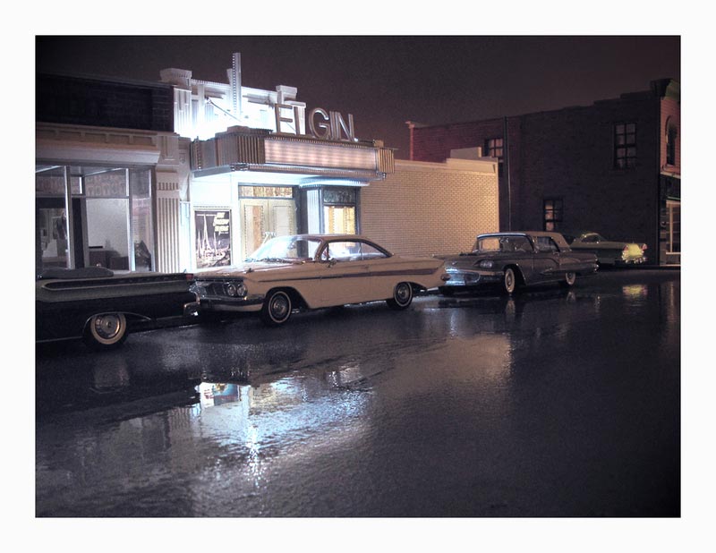
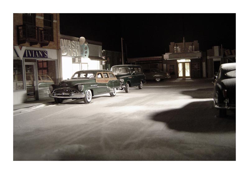
The finished night scene photograph. Michael offered his interpretation of this image: “The Elgin movie house, built in 1927, is now 35 years old and desperately out of step with 1962. Third run movies, such as ‘First Spaceship to Venus’, plus a marquee that has long lost it’s red plastic letters, only add to the feeling that an era has passed. Yet the Elgin still has dignity. I know for a fact it will survive into the 21st Century.”
To Use or Not to Use PhotoShop
After I have the shot I like, I will sometimes give it a “period” look by using filters to reduce the color, or trying to mimic a type of film used years ago. I gave myself the challenge of not using PhotoShop to manipulate the physical elements of the photo. I wanted to be able to frame everything in the camera.
I’m glad I stuck to that because it forces me to be observant and focused. Once, an insect landed on one of the diecast cars, and I didn’t notice it until I looked at the digital contact sheet. The shot was good and I couldn’t redo it, so I did use PhotoShop to remove it. But as a rule, PhotoShop is just a touchup tool.
The Camera
The camera that I use is only a 6 megapixel Sony. Anything above that captures too much information. I had a 3 megapixel camera that took better “vintage” photos because the lens wasn’t that good. Actually, old camera lenses caused a mild blur in the photos, and it’s that blur that holds the key to the look of the past—at least for me.
The blur adds emotional distance and mystery to the photograph. And that’s also the reason why there are no people in my pictures. I want the viewers to put themselves into these landscapes and not be distracted by other people.
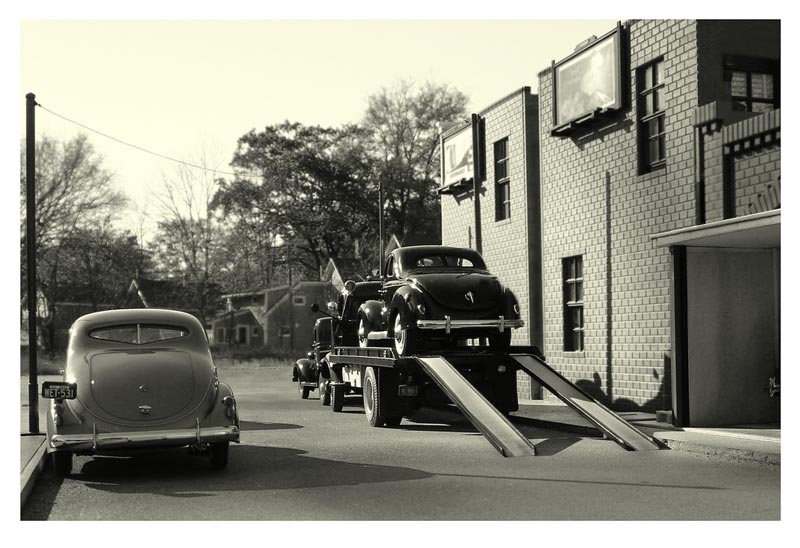
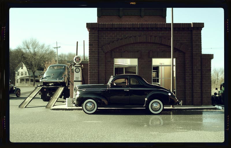
Elgin Sales takes a delivery of a new model car—a 1939 Ford Deluxe Coupe. Notice that Michael played with two different filters for this photo and the following shot of Elgin Sales.
Why Do People Like Scale Models?
What I’ve found is that people like looking at a physical model. Models help us to put big things into manageable proportions. We can walk around them, touch them, and share the room with them. (Computer generated drawings have a WOW factor, but to me they seem too perfect, although this is not to say they aren’t visually powerful.) We know buildings are large, yet when you see a building that’s only one foot tall and it still looks like a building, you can understand what it’s all about.
The Secret to the Popularity of These Images
As for the photographs of the models, they bend and twist a known reality once a viewer realizes what they are seeing. Questions like, “How did you make it look real?” and “Where does the model stop and the real world begin?” always come up. The subject matter itself brings up long-forgotten thoughts or incidents.
This is not always about nostalgia. I believe the photographs let us somehow get in touch with the arc of our lives. About how much has happened in such a short period of time. Many people have written that they feel a deeper story is going on in my work. It’s not about the cars or the buildings per se, but of childhood, family, longing, happiness, love and sadness.
Another form of inspiration comes from trying to capture the feel of the past. There are a million tiny details, sounds, smells and vibes specific to any era that just don’t exist anymore. So my challenge is how to proceed knowing that.
The solution I came up with is to use a visual shorthand: the look of building facade in the rain, a car parked up on the curb, a dimly lit street, a puddle of water reflecting light, telephone poles leaning, buildings cobbled together, and the layer of “time having passed” over everything.
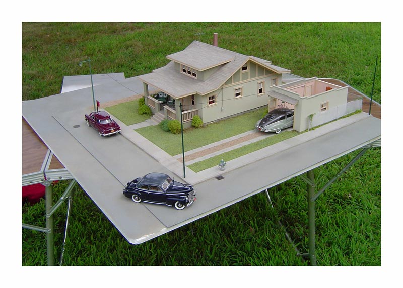
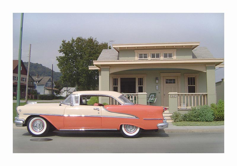
Michael’s scale model bungalow was set outside for a shoot. This small home is typical of the era and fully furnished. Michael used the bungalow house for several different Elgin Park scenes. The stucco texture of the walls was achieved by daubing multiple layers of flat latex house paint over the whole structure.
There is also adding details to a building that lets the viewer know a 1930’s structure was renovated in the late 50’s. Studying old photographs is priceless to what I do. Not the posed ones, but the snapshots and outtakes in which insignificant moments in time have been captured. We all know how certain smells can bring your past back. I’ve found that to be true in the visual world, too. Colors, shapes, lighting—they all trigger responses in us.
This is what I try to achieve, for these are the touch points that start us filling in our own personal details. The play Our Town is another inspiration. When the girl who has died wants to come back and relive one more day; she’s told to pick the most insignificant day so she won’t be overwhelmed. Even then, the smallest, most mundane details become almost unbearable.
These two shots demonstrate change over time in Michael’s fictional Elgin Park. On the left side, it’s Saturday night and the county fair has the carbon arc searchlights beaming into the sky. Smoke was used as a special effect to help make the sky look less flat. On the right, it’s 23 years later, and the town has slowly changed. The theater was torn down and a two-story retail building was put in its place. The Chamber of Commerce allowed a large billboard to be placed on the Gilmore gas station roof, hoping to bring in more revenue. Mr. Kenmore bought the corner store and renovated it. An outside phone booth was installed across the street. Automobiles became larger, and the traffic more dense.
If you look at all my photos, you can see the learning curve in terms of getting things to look more realistic. The earlier ones have a slightly staged feeling to them, and are somewhat cleaner in appearance, although this is not a bad thing. As time went on, I got braver by sprinkling dirt and dust on everything, which helped to add another level of detail. Being outside with real backgrounds and sunlight was yet another layer of reality.
There is a bit of Norman Rockwell in my earlier photos because his work mirrored what I had experienced when I was young—a safe and loving childhood. My later pictures are a bit more realistic, yet they are not fearful or emotionally gritty.
—Michael Paul Smith
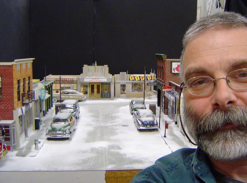
The setup for Michael’s scene entitled, “Saturday, 10 PM.” A light snow (baking soda) has just fallen on the town. A small snow drift at the curb and a few tracks add to the wintertime feel.
After Michael Paul Smith’s passing, The New York Times wrote another article highlighting his wonderful work. Michael’s Flickr page is also still up, and full of photos and information on his tiny scale model town.
Additionally, Michael’s work was highlighted in a short film feature for National Geographic.
View more photos of Michael Paul Smith’s imaginative Elgin Park.

